IWA Yakiniku Emenu
Design a full flow menu for iwa japanese yakiniku
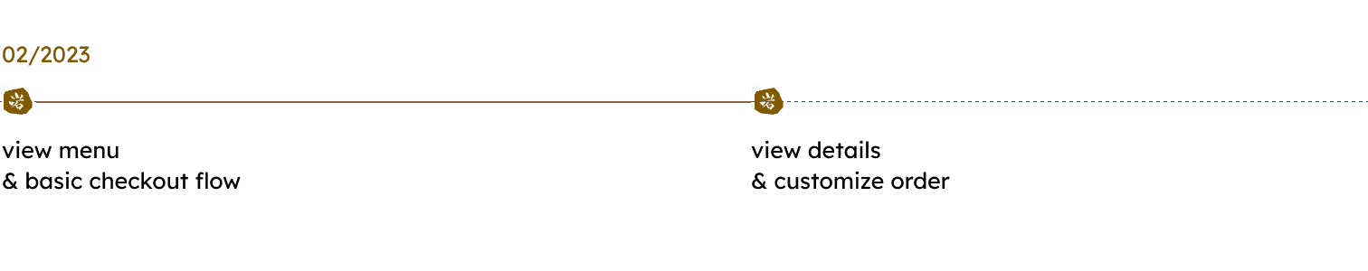
timeline
02/2023
role
UI/UX Design
platform
iOS, Android (tablet)
category
Food and Drink
The F&B industry has seen a significant shift towards digitization in Vietnam in recent years, with the introduction of e-menus. In line with this trend, our team of designers and developers worked closely with My Life’s operation team to create an intuitive and visually appealing e-menu.

context
IWA is a newly launched luxury restaurant so its customers mostly have a high income. Eventually, the requirement for us here was to create an aesthetic e-menu, yet seamless.
At the moment, IWA is using the traditional paper menu to take orders, which causes them more workforce and longer processes.
Due to the closed deadline, which only allows us to implement the menu in 1 month, we split the plan into 2 phases.

Let's dive in the process
analogous research
Here in Vietnam, I went to some of the popular restaurants which use the automatic order flow on tablets. Some of which are Pizza 4P’s, Haidilao, and Manwah.
In order to get a more open view on the flow, I also did quick research on some food ordering applications (Be Food, Grab, Baemin).
What I took away after quick research
review and analyze visual style
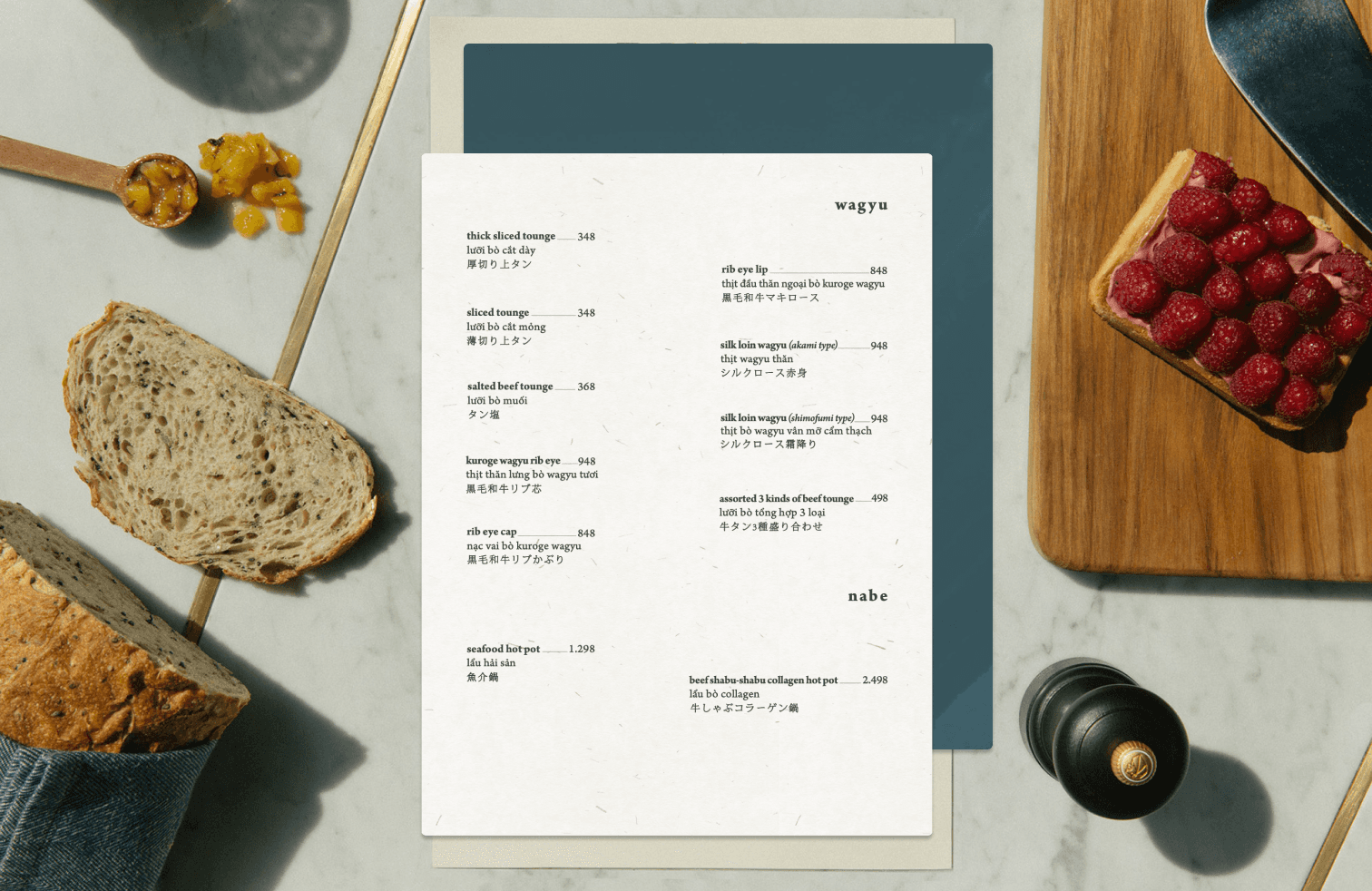
We were provided with the concept and aesthetic guidance by the Graphic Designer on the My Life team, which we incorporated into the existing paper menu design.
It is worth noting that the presentation is in Vietnamese, as our client hails from Vietnam 😊


Following our initial meeting, we selected the recommended layout for Phase 1. However, we have encountered a limitation in that the restaurant is currently unable to take photographs of each dish. Therefore, we must opt for a design that minimizes the use of images as much as possible.

understand the customers
Although the stakeholder is MyLife, our end users are actually the customers who come to eat at the restaurant. That's why even it's just a simple order flow, I still spare some time to capture basic characters of whom using the menu.
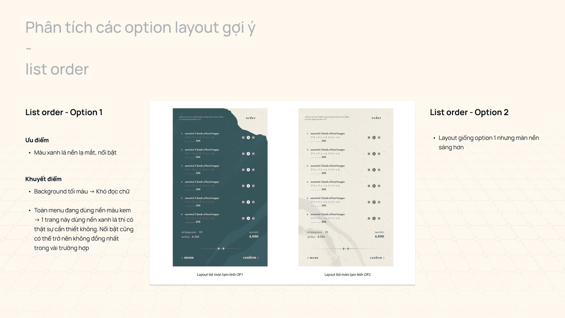
draft ~ get feedback ~ draft
Since we had a such specific style and layout reference, I didn't explore much of difference layout. Here is the first and second version, respectively, with the feedback we received.


Then, here is the third try. In this design iteration, we updated on the home screen navigation and focused on improving the menu category list.

As analyzed above, we picked option 3 for the development.
final


End of story